> For the complete documentation index, see [llms.txt](https://mobsted-2.gitbook.io/knowledge-base/llms.txt). Markdown versions of documentation pages are available by appending `.md` to page URLs; this page is available as [Markdown](https://mobsted-2.gitbook.io/knowledge-base/references/intro-placeholder/constructor_elements.md).
# Constructor elements to build your app
### ALL ELEMENTS PROPERTIES
* **Backendname**: used to reference the еlement from different parts of the app. The value stored in **Backendname** can be displayed on screen, used in calculations or in logical conditions via [Hashtag](https://kb.mobsted.com/article/9v4k7sfkq1-hastags)
* **Visibility**: displayed by default. Hide / Show condition can be set using AND / OR parameters
* **Loop**: reiterate the element based on [Smart Filter](https://kb.mobsted.com/article/gzp3oanbxi-smart-filters) or API Call.
####
### ALL ELEMENTS STYLING OPTIONS
* **Margin**
* **Padding**
* **Borders**
* **Corners**
### TEXT INPUT AND TEXT AREA
Use **Text Input** and **Text** area to allow users input single line text values. Each input data is available across the platform via [Hashtag](https://kb.mobsted.com/article/9v4k7sfkq1-hastags) link mechanism.
### TEXT
Use **Text** element to display a text on app screen. The element can contain static as well as dynamic text, which is loaded from different elements of the platform or API calls using [Hashtag](https://kb.mobsted.com/article/9v4k7sfkq1-hastags).
**Text** element functionality:
* Content can be displayed/changed dynamically via [Hashtag](https://kb.mobsted.com/article/9v4k7sfkq1-hastags) reference: #Backendname:**txtMyText**:value#, where **txtMyText** is a text **Backendname**
* Content can be placed multiple times in cycle using [Loop](https://kb.mobsted.com/article/cv0t24tdm6-use-filters-and-display-multiple-line-results-in-app).

### BUTTON
Use **Button** to perform the following [actions](https://kb.mobsted.com/article/4jb98oxf8g-process-user-actions-switch-screens-manipulate-data-make-api-calls):
* navigate between screens
* save user data
* make API calls.

**Button** element specific properties:
* **Text** field: the text entered into **Text** field is displayed to app user.
Text is changed and accessed dynamically via [hashtag](https://kb.mobsted.com/article/9v4k7sfkq1-hastags) data link #Backendname:**btnMyButton**:text#, where **btnMyButton** is a button **Backendname**
### RADIO BUTTON
Allows user to select one out of multiple options.

After selection is done, user can change it for other option in the list, but can not leave the list with no selection.
**Radio button** element specific properties:
* **Label**: text displayed to user on the screen for this particular option
* **Value**: used in case you want to store the value different from the label option in Backend. For example, you place on **Label** "I like it", and in **Value** you store "LIKE". Can contain **Hashtags**
* **Selected**: check this box to set a default pair Label / Value for selection.
### CHECKBOXES
Allows to check / uncheck one or more options simultaneously.

**Checkboxes** element specific properties:
* **Label:** text displayed to user on the screen for this particular option
* **Value**: used in case you want to store the value different from the label option in Backend. For example, you place on **Label** "I like it", and in the **Value** you store "LIKE"
* **Selected:** check this box to set a default pair Label / Value for selection.
### SELECT
Allows to check / uncheck one option from dropdown list.

After selection is done, user can change it for other option in the list, but can not leave the list with no selection.
**Select** element specific properties:
* **Label:** the text an app user will see on the screen for this particular option.
* **Value**: is used in case you want to store the value option different from the label option in Backend. For example, you place on **Label** "I like it", and in the **Value** you store "LIKE".
* **Selected:** check this box to set a default pair Label / Value for selection.
### DIVIDER
Use it to visually separate parts of the same screen.

Use single divider to make a slight separation and double or more dividers to make group of elements to look like a plank.
### LINK
Use links to allow user to make transition to other screens and websites. Link can initiate [actions](https://kb.mobsted.com/article/4jb98oxf8g-process-user-actions-switch-screens-manipulate-data-make-api-calls) to:
* navigate between screens
* save user data
* make API requests.

### IMAGE
Place images to app screen. Image can initiate [actions](https://kb.mobsted.com/article/4jb98oxf8g-process-user-actions-switch-screens-manipulate-data-make-api-calls) to:
* navigate between screens
* save user data
* make API requests.

**Image** element specific properties:
* **Image Alternative Text** - \... \ alternative text to display instead of image
* **Image Source (URL)** - image source URL.
### CUSTOM HTML
This element functions within a screen and provides capability to:
* render data from any hashtags
* override style settings
* create a fully customized experience on top of basic platform infrastructure.

You can access elements on screen by **Backendname**, where **Month** is **Backendname** of the element:
```
var x = document.getElementsByName("Month");
```
Or using hashtags:
```
#BackendName:name#
```
Paste HTML or / and CSS code into **Default Value** field in element properties.
### YOUTUBE
Embedding widget to place YouTube videos on the app screen.

###
### UPLOAD FILE
Preload one or multiple files to the platform and save with [action](https://kb.mobsted.com/article/4jb98oxf8g-process-user-actions-switch-screens-manipulate-data-make-api-calls) to the platform.
**Upload file** element specific properties:
* **Caption Button:** specify the button caption
* **Type Button:** contains several predefined button looks
* **List header:** title of the files already preloaded to an app
* **Allowed file extensions:** list of file extension allowed to be uploaded
* **Minimal allowed file size (Kbytes)**
* **Maximal allowed file size (Kbytes)**
* **Allow multiple files check:** allow/not allow user to preload multiple files before submit.
**Images specific properties:**
* **Auto-compress large files check**
* **Maximal width of compressed image**
* **Maximal height of compressed image**
* **Compression quality, 0-no, 1-max**
* **Convert large PNG to JPG starting from (Kbytes)**
### ROW
Use **Row** element to place several elements in a row.

**Row** element specific properties:
* **COLUMNS** - to add, remove and style columns of a row. Click on column to edit it's properties the same way as for other elements.
**Example:**
Using rows in Water delivery app to select the size.
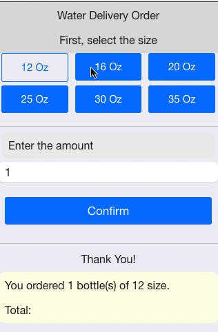
**How it was set up:**
We had two rows with three columns each and pairs of buttons in each column. We made them visible / hidden using [Variables](https://kb.mobsted.com/article/77ajmb48r2-variables).
####
### TOOLBAR AND BOTTOM TOOLBAR
**Toolbar** and **Bottom toolbar** allow to stick elements row to a top or a bottom edge of app screen.

**Toolbar and Bottom toolbar** elemets specific properties:
* **COLUMNS** - to add, remove and style columns of a row. Click on column to edit it's properties the same way as for other elements.
####
### MENTIONED ARTICLES
* [Hashtags](https://mobsted-2.gitbook.io/knowledge-base/hashtags)
* [Smart filters](https://mobsted-2.gitbook.io/knowledge-base/smart_filters)
* [Apply loops to screen elements](https://mobsted-2.gitbook.io/knowledge-base/apply_loops_to_screen_elements)
* Variables
* [React to user actions](https://mobsted-2.gitbook.io/knowledge-base/actions)
### RECOMMENDED ARTICLES
* [Show / hide screen elements](https://mobsted-2.gitbook.io/knowledge-base/hide_show_screen_elements)
* Events
* [CSS quick guide](https://www.w3schools.com/)
